
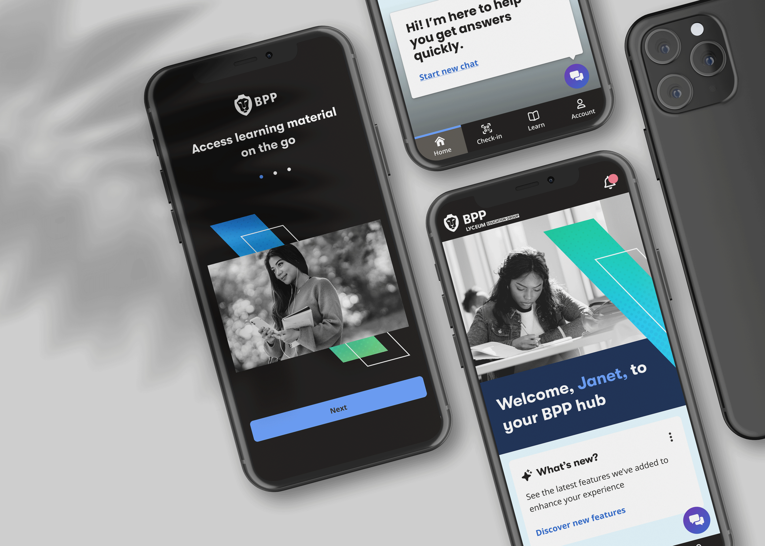
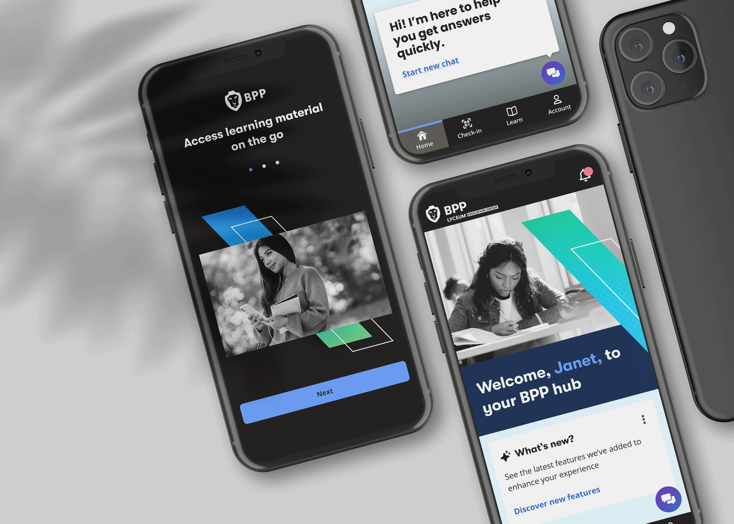
At a glance
BPP Learner App
Led end-to-end product design for a mobile-first learner experience across iOS and Android.
OVERVIEW
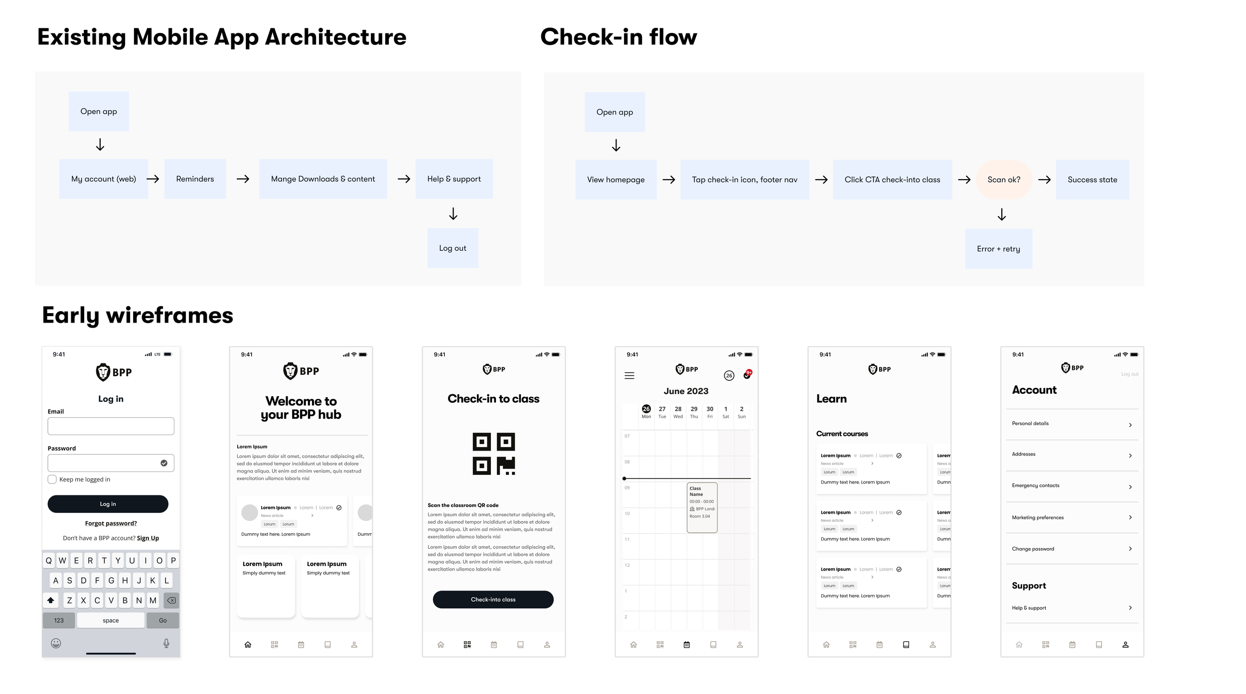
The existing app was essentially a shell — it redirected students to web platforms for nearly every meaningful task. Checking a timetable, marking attendance, finding support: each one required leaving the app entirely. The result was friction at every touchpoint, and a product students opened reluctantly.
The brief was to redesign the app into a genuinely useful, centralised mobile experience — one that students would actually choose to open.
KEY PROBLEMS
Fragmented systems — learners had to jump between multiple tools to complete simple tasks
Generic content — every student saw the same information, regardless of course or campus
High‑effort navigation — students had to search rather than be guided
Poor prioritisation — important actions weren’t surfaced clearly
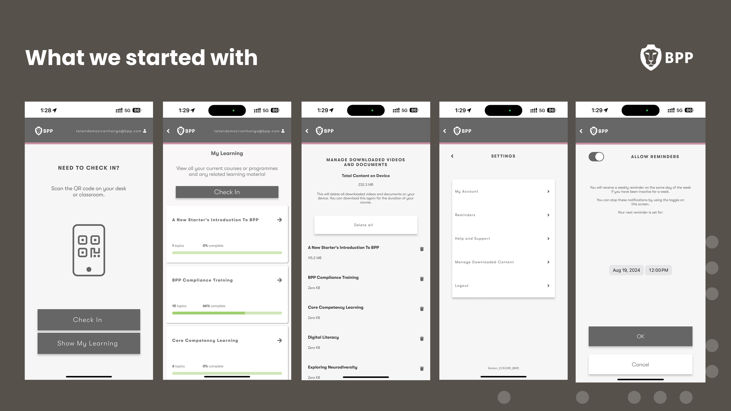
The legacy app created unnecessary friction across tasks, leading to low satisfaction and inconsistent engagement.
MY ROLE
I led end-to-end product design for the new BPP mobile app:
Defined the product vision and experience strategy
Prioritised MVP scope with Product and Engineering under tight delivery constraints
Facilitated cross-functional alignment across service design, engineering, and student stakeholders
Partnered with research to validate concepts through surveys, interviews, and prototyping
Worked closely with engineering to navigate legacy system limitations and reduce delivery risk
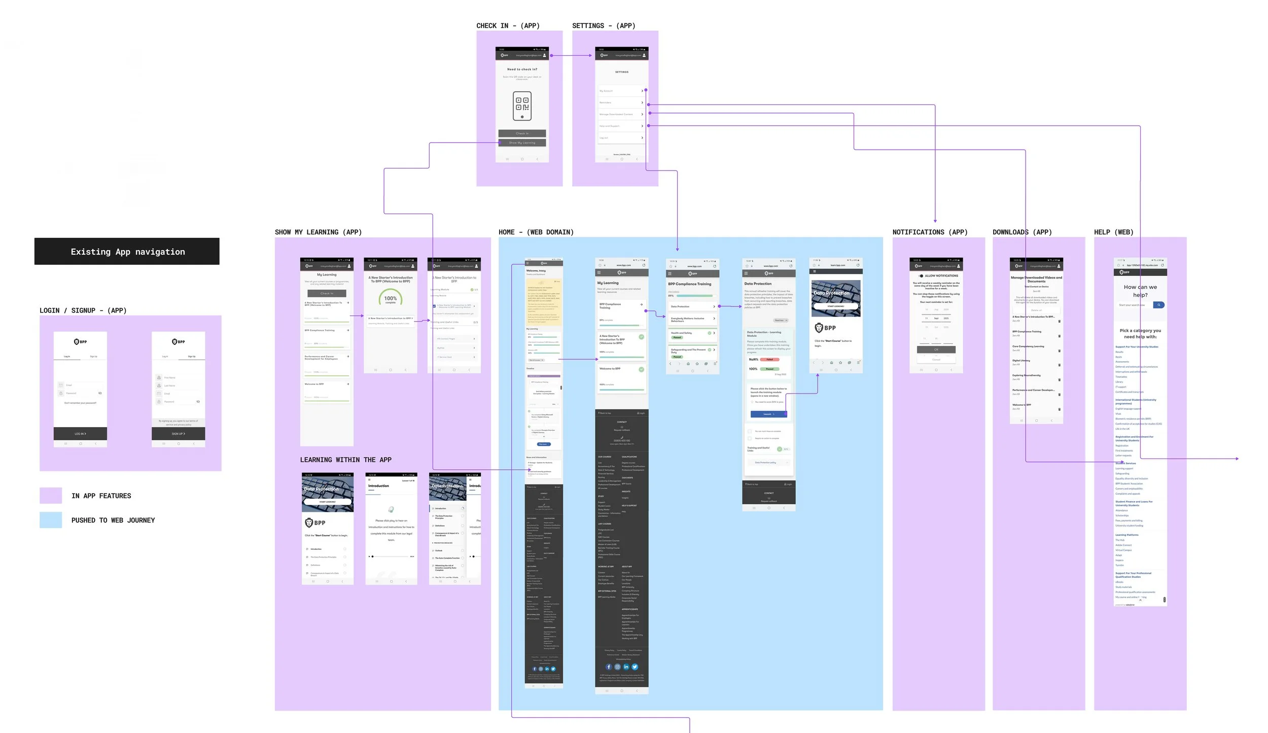
Mapping the existing app flows to identify where students were being pushed to the web
RESEARCH & DISCOVERY
What we tested
Current app experience
Desired features for the new app
Notification and alert preferences
Appetite for roadmap features
Why we tested it
To validate roadmap assumptions
To identify gaps in the current experience
To understand learner priorities and pain points
To co‑create and ideate with students
To ensure the MVP delivered immediate value
To ground the redesign in real student behaviours, I contributed to both quantitative and qualitative research across the student lifecycle.
Research Activities
Designed and distributed a survey to 800+ students
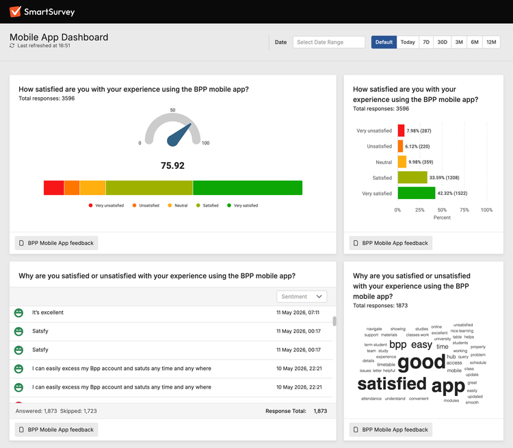
Proposed an in-app CSAT feedback loop to continuously capture user sentiment
Conducted student interviews to validate early concepts and gather behavioural insights
Reviewed support pain points and recurring usability concerns
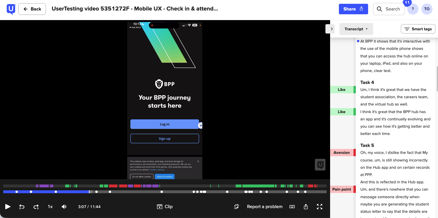
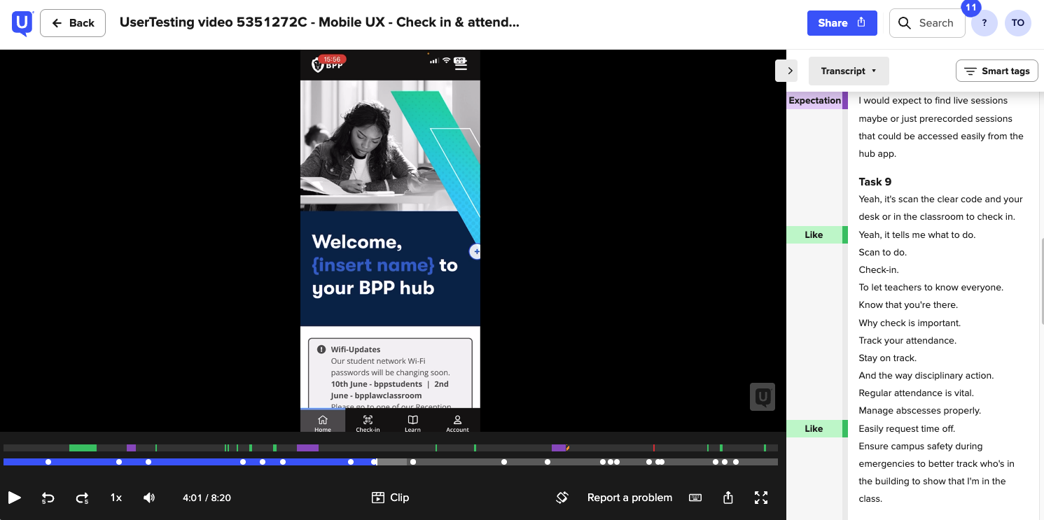
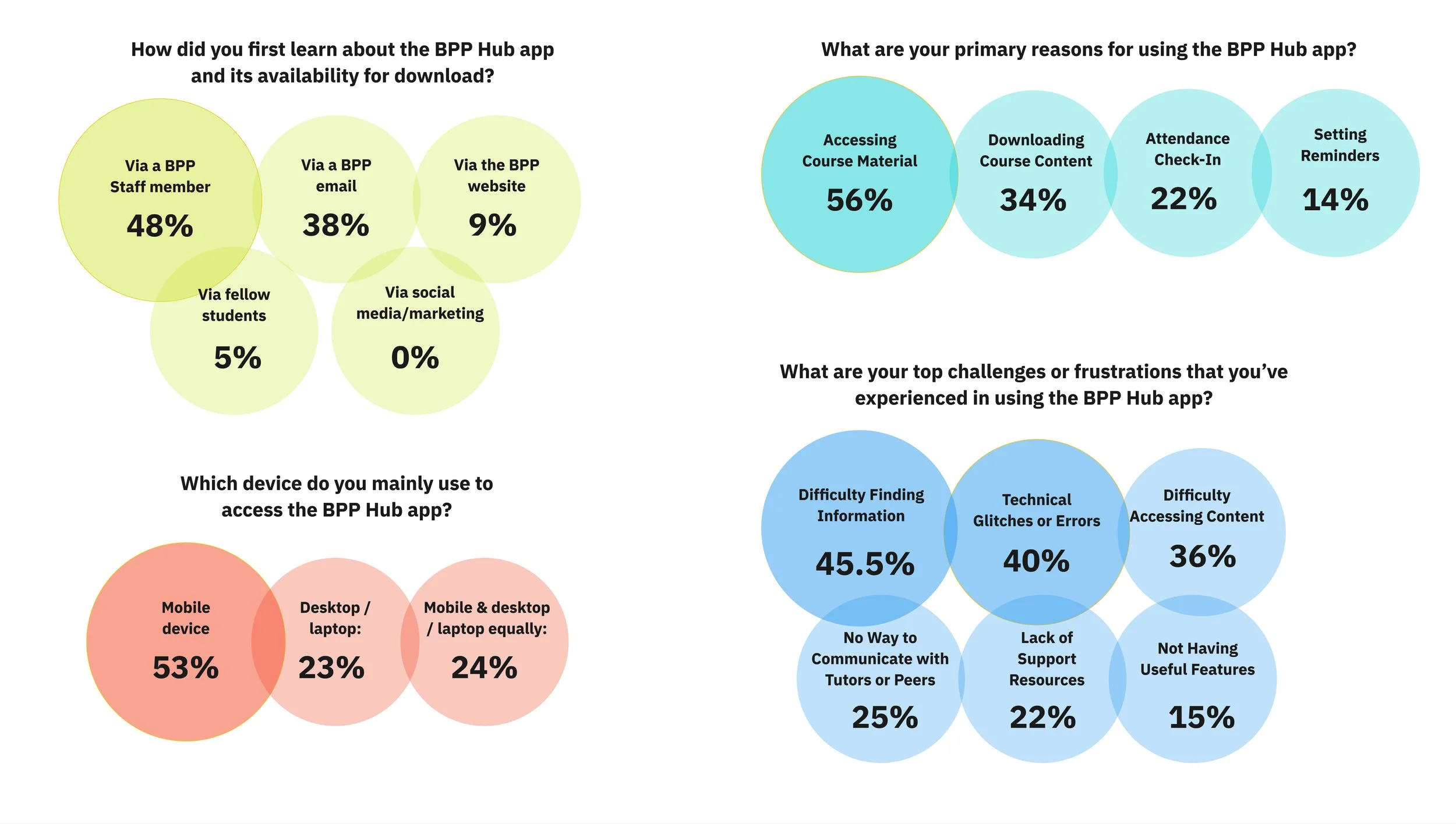
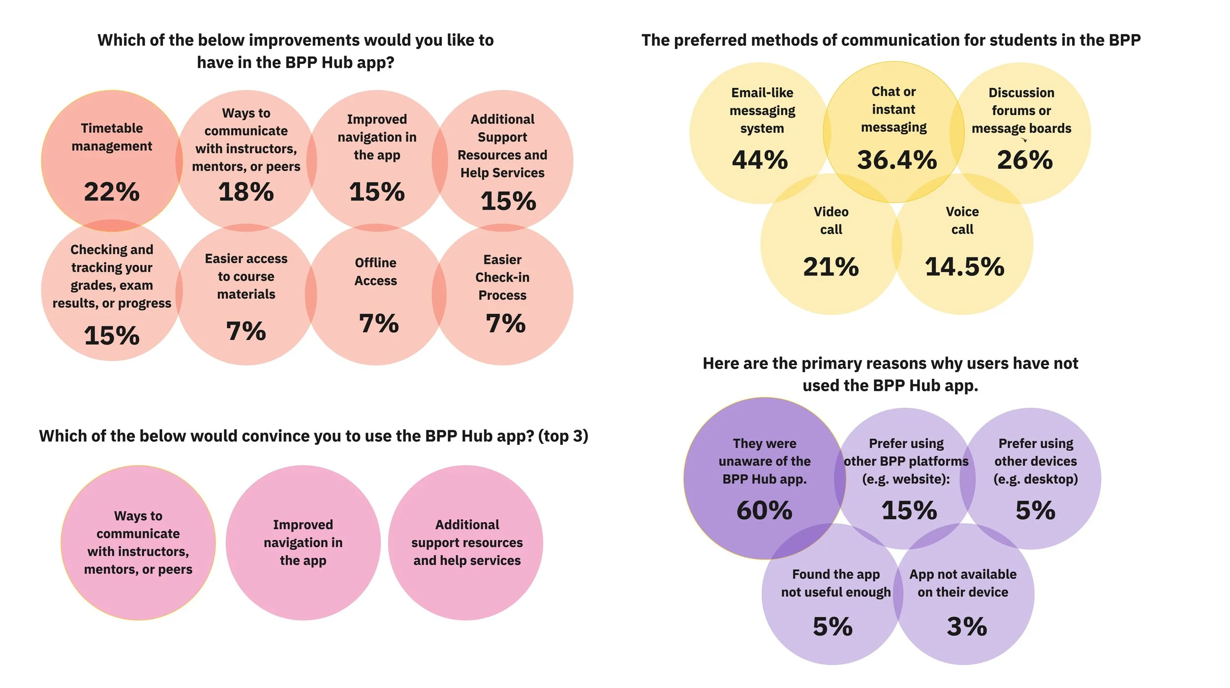
Students primarily wanted the app to help them:
Show timetables clearly
Provide visibility on fees and outstanding payments
Improve access to learning materials on the go
Provide a simple way to submit and track queries
Self-serve administrative tasks
Stay informed through timely updates and notifications
KEY INSIGHTS
Students responded positively to the idea of a more capable mobile experience, but wanted more — more functionality, more personalisation, and everything in one place. Navigation and discoverability emerged as increasingly critical as the feature set grew. Students consistently associated active learning with desktop, while mobile was seen as an organisational companion.
PRIORITISATION & TRADE-OFFS
Given the aggressive timeline, we needed to make strategic trade‑offs. For MVP we prioritised features that:
Delivered immediate value
Reduced reliance on web redirects
Were technically feasible within the timeframe
Supported core student logistics
What we deferred
Some features, such as fee payment tracking, relied on complex legacy system integrations and were moved to the post-MVP roadmap.
The redesigned experience focuses on clarity, mobile‑first workflows, and reducing friction across the journeys students use most.
PHASED DELIVERY
The app was delivered across two MVP releases to validate core functionality before expanding the experience.
MVP 1 — Core Experience
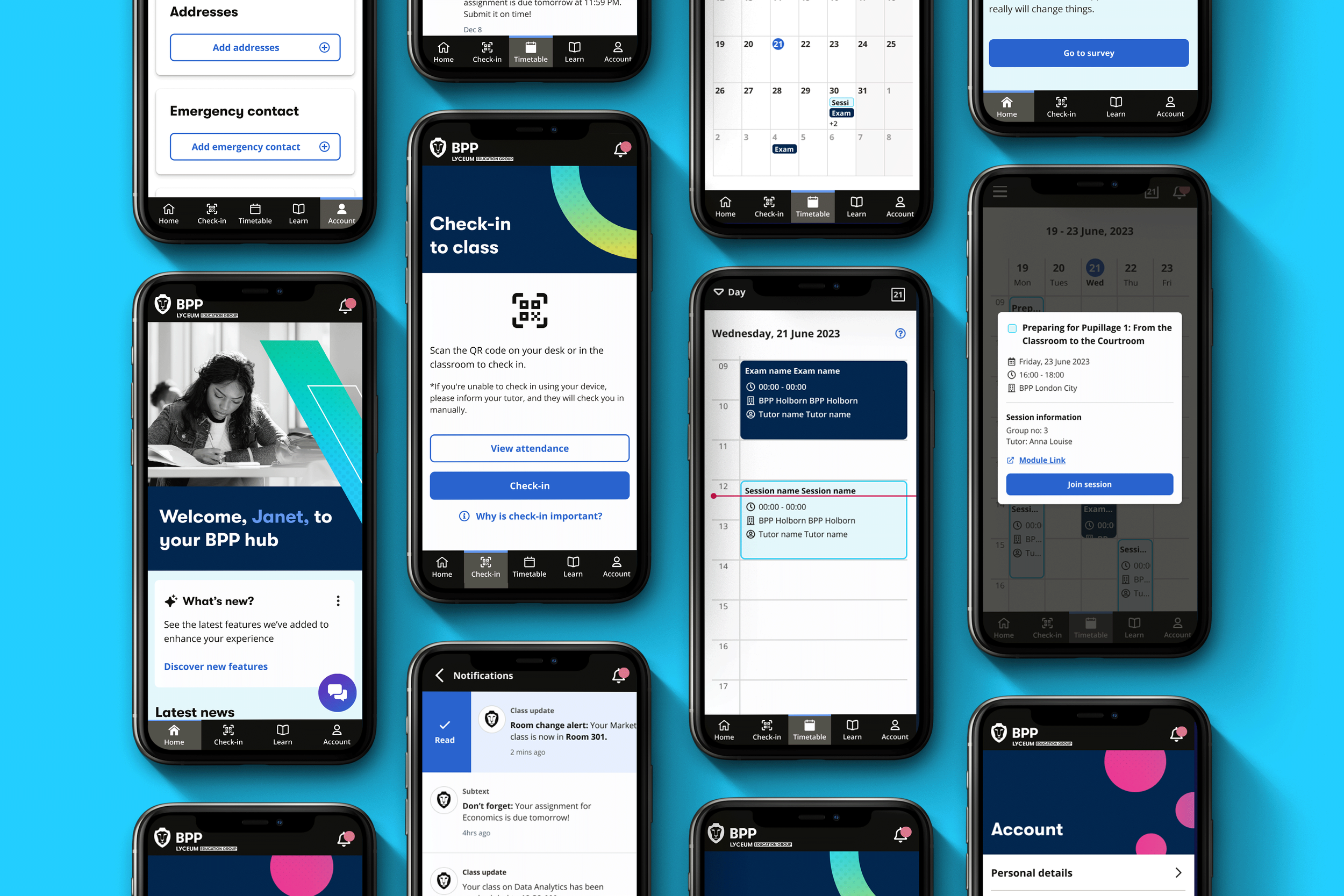
Live timetable access and updates
Redesigned navigation and information hierarchy
My Account management
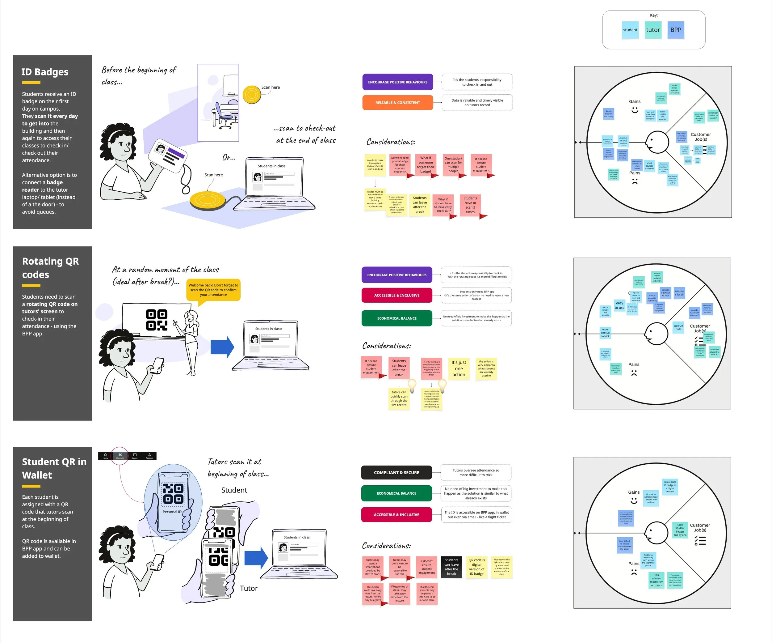
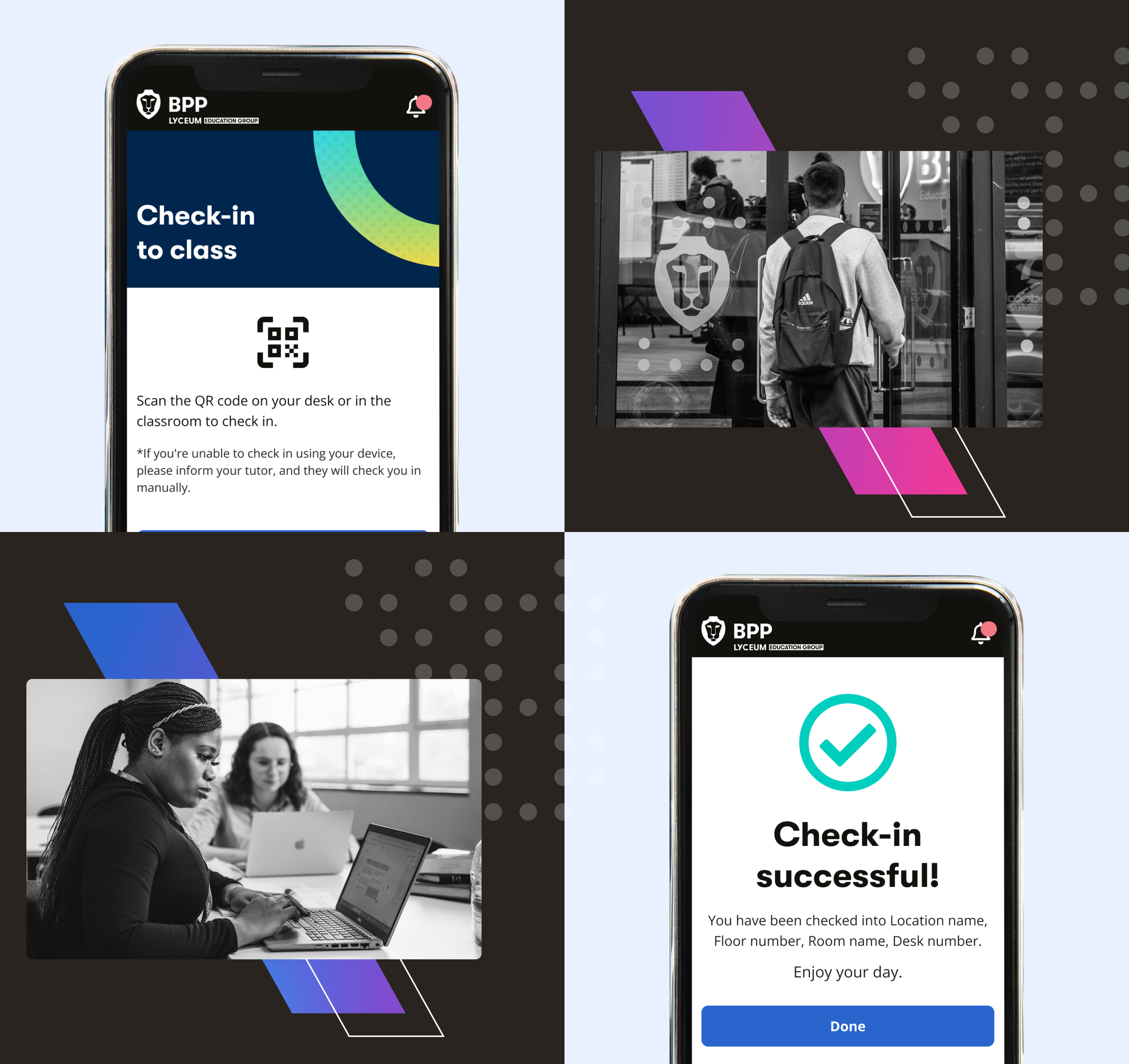
Improved QR check-in states
MVP 2 — Extended Experience
Push and in-app notifications
AI chatbot support outside office hours
Query form flow
New features walk-through
WHAT WE DELIVERED
Real-time Timetable Access
Learners can view and manage their schedules with live updates, including class and exam changesRedesigned UX & UI
A cleaner, more intuitive interface that improves navigation across core tasksMy Account Management
Users can easily update personal details, making the app a more self-sufficient toolQR Code Check-in Improvements
Clearer success and failure states, improving usability and reducing confusionInstant support via our AI Chatbot
Giving students instant access to help outside office hours
IMPACT & OUTCOMES
Within the first two weeks of launch:
88% adoption rate of the new app
Customer satisfaction (CSTA) increased 30+ points to ~74+
+40% DAU and +65% WAU growth, lifting MAU to ~74%
Timetable reached 84% feature engagement
The strongest validation wasn't just the 88% adoption within two weeks. It was seeing students change their behaviour. Features like the timetable became part of their daily routine, confirming we'd prioritised the right problems for the MVP. These early indicators validated our decision to prioritise clarity, logistics, and mobile‑first workflows in the MVP.
“Great app, easy to navigate.
Love that I have access to my timetable on the go”