OVERVIEW
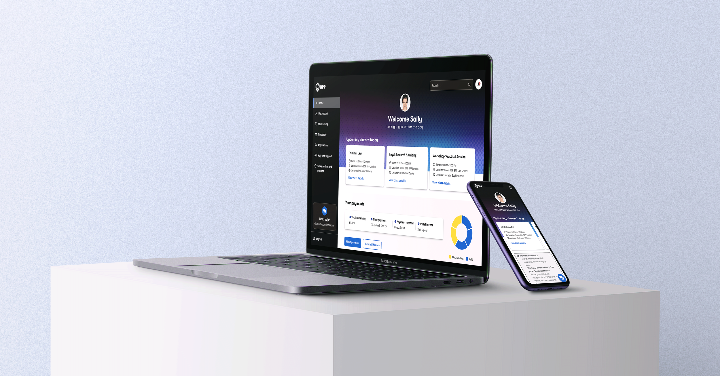
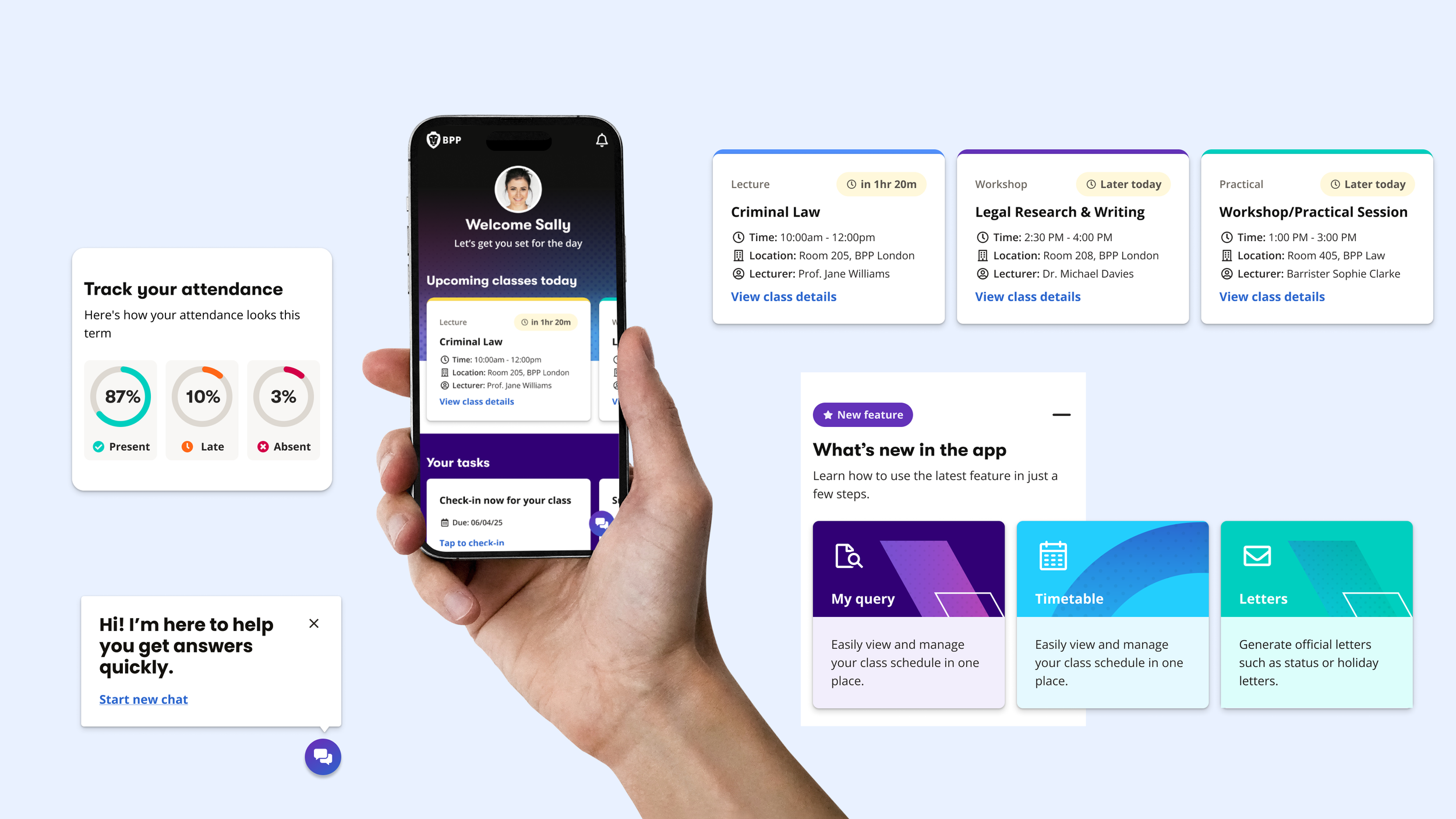
As part of ongoing work on the student experience, I explored a future vision for the Hub homepage — reimagining it as a personalised dashboard rather than a static landing page.
The goal was to create something that could:
Bring together key student tasks in one place
Reduce friction across systems (learning, payments, support)
Surfaces what matters now rather than making students search
Replaces the existing homepage with something dynamic and actionable
This wasn’t tied to a specific sprint or delivery timeline — it was a direction-setting piece to help align teams and spark conversations about where the product could go next.
THE PROBLEM
The existing Hub experience felt:
Fragmented — students had to jump between multiple systems
Static — the same content for every user, regardless of context
Task‑heavy — students had to search rather than be guided
Poorly prioritised — important information wasn’t surfaced clearly
From early insights and stakeholder discussions, it was clear students mainly came to the Hub to:
Check their timetable
Manage payments
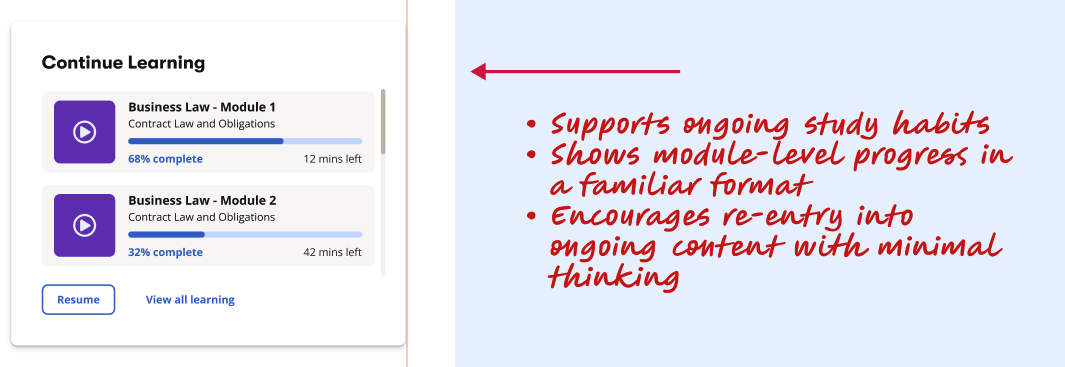
Continue learning
Track attendance
Find support
But these journeys weren’t well connected, and the experience couldn’t adapt to different learner needs.
IDENTITY CONSTRAINTS
We cannot reliably identify who a learner is once they log in
No consistent signals for course, campus, study mode, or learner type
A law student may see business‑school updates
International learners may see domestic‑only information
Personalisation is currently impossible due to backend limitations
THE OPPORTUNITY
I saw an opportunity to shift from:
“A homepage with links” → “A personalised dashboard that actively supports students”
The idea was to create a central, intelligent surface that:
Surfaces what matters now
Adapts to the individual student
Reduces cognitive load
Encourages engagement (learning, attendance, progression
Payments
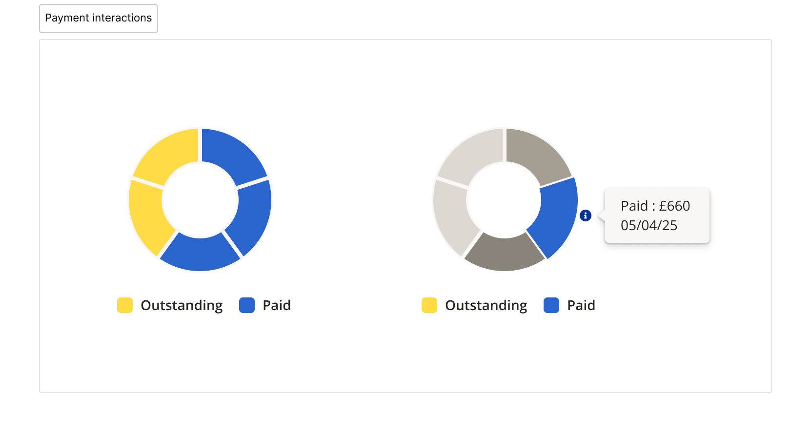
Placed high on the dashboard because finance was identified as a high-anxiety student task. The interactive piechart gave students an at-a-glance overview.
DESIGN PRINCIPLE
Surface what matters now — prioritise immediacy and clarity
Reduce cognitive load — fewer decisions, fewer clicks, less friction
Personalise based on identity and behaviour — once signals improve
Connect journeys across learning, payments, and support
Create a scalable component system — adaptable across programmes and campuses.
WHY THIS VISION MATTERS
Students rely on the Hub daily for learning, payments, attendance, and support
Current journeys are fragmented across multiple systems
A personalised dashboard could reduce friction, increase engagement, and surface what matters most
It provides a north star for future roadmap planning
APPROACH
Mapped current journeys across learning, payments, and support
Identified gaps caused by fragmented systems and missing identity signals
Defined a north‑star experience that could scale as backend capabilities improve
Created a future‑vision prototype to align with the wider product team and guide roadmap planning
MY ROLE
I led the UX and UI design for this concept, including:
Defining the structure and content hierarchy
Exploring interaction patterns and component design
Designing the end-to-end dashboard experience (desktop-first)
Thinking through personalisation and cross-sell opportunities
Facilitating discussions with product, service design, and engineering
Bringing the prototype to life with Claude Design.
POTENTIAL SUCCESS METRICS:
Increased daily engagement with the Hub homepage
Higher payment completion rates through surfaced reminders
Fewer support queries as self-service improves
More students returning to in-progress learning content
NEXT STEP
Validate the concept with students across different schools and campuses.
Partner with engineering to explore identity‑signal improvements.
Prioritise components for phased delivery.
Align with service design and product teams to integrate into the roadmap.