I redesigned an app students only opened when they had to.
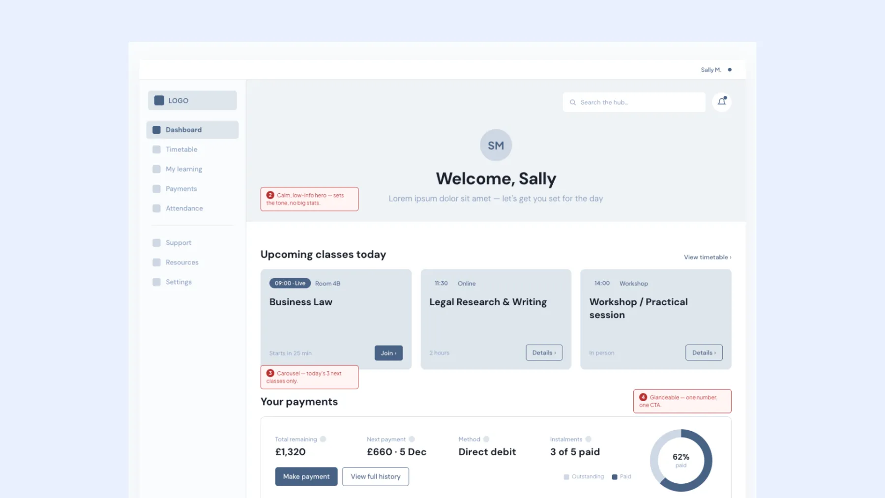
- 1Timetable first, because it's the moment students actually open the app for. 84% engage with it.
- 2Fee tracking deferred. Legacy integrations weren't ready, so I didn't pretend they were.
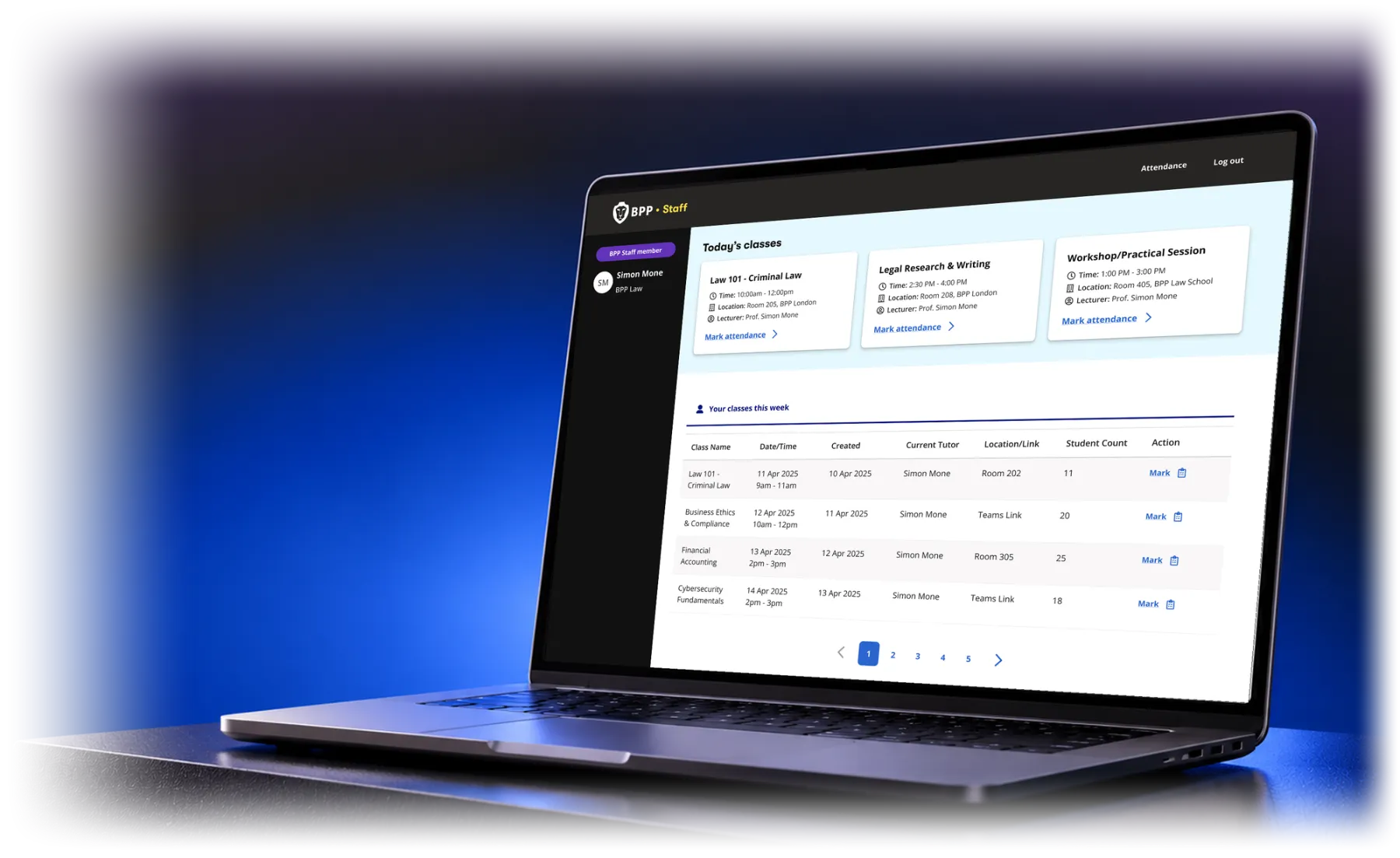
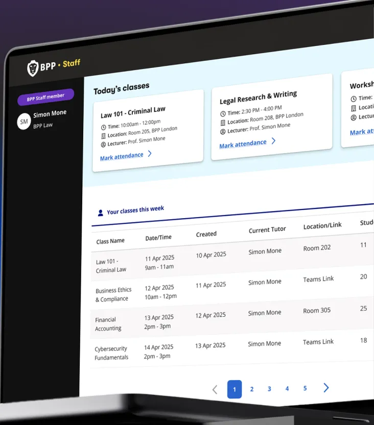
Attendance had no real process, and it was taking tutors’ time away from teaching. I led design of the Tutor Portal’s first release, from concept to MVP.
Why that was the most useful thing we learned, and how it turned support chatbot-first.
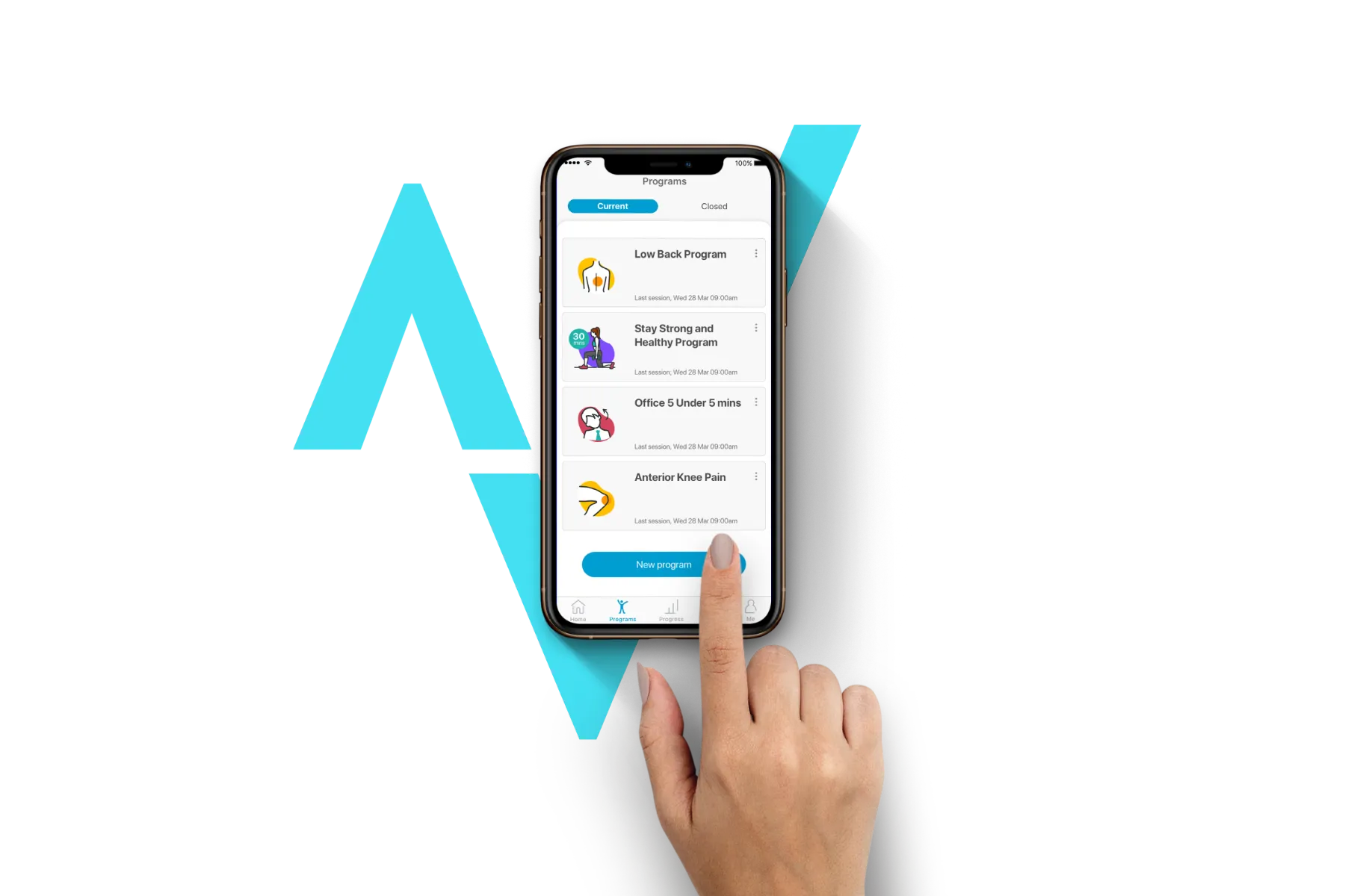
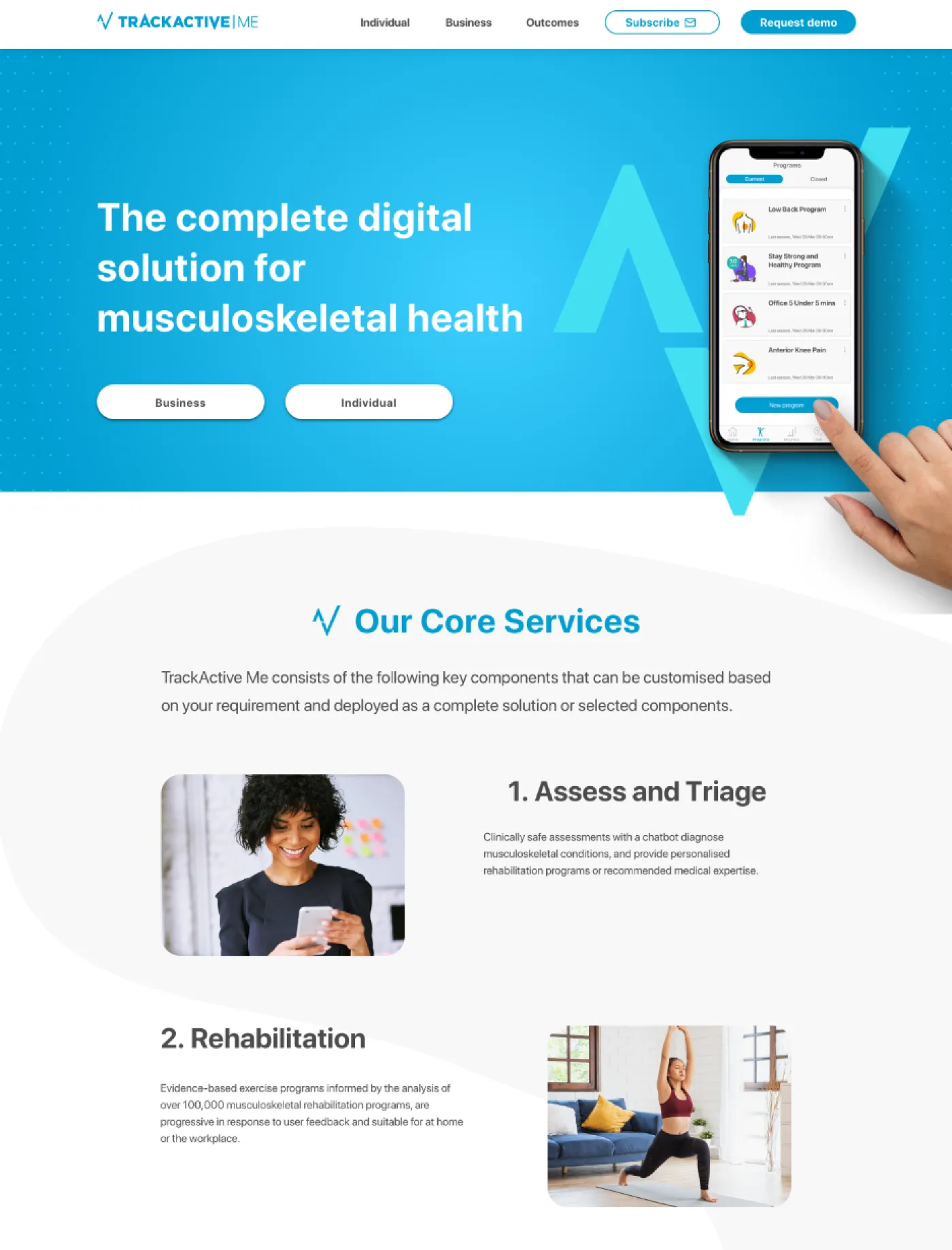
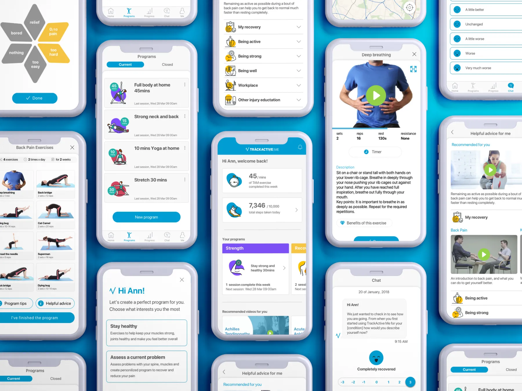
TrackActive Me helps people manage muscle, joint and back pain, and is used by insurers, employers and the NHS.
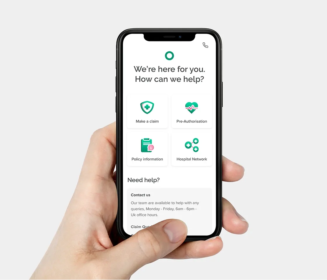
Claiming on health insurance abroad means foreign providers, foreign currencies and paperwork, often while you're unwell.

A graphic designer's eye, a product designer's priorities.
I started in graphic design, then moved into product. I care how things look, but I care first about whether they work.
I've designed in-house at a large education group, in startups, including HealthTech, and with agencies on pharma and global learning platforms. The products vary, from support journeys and insurance claims to pain management and internal tools, but the principle stays the same: make the next step obvious, and make it look like someone took the time.
When I'm not designing, I'm running.
“She's a generous collaborator, a sharp design thinker, and someone who lifts the standard of everyone around her. Any team would be lucky to have her.”
“Beyond her design craft, Tracy is simply brilliant to work with and great fun. Highly respected, generous with her knowledge and expertise. I recommend Tracy without reservation.”
“Tracy immediately hit the ground running, tackling highly complex project briefs head-on with an almost mind-reading ability. A calm, collected, in-demand design professional who's a joy to have on any project.”
{{ c.standfirst }}
“{{ ch.text }}”
{{ para }}
“{{ ch.pull.text }}”
{{ walkCur.d }}
{{ walkCur.w }}
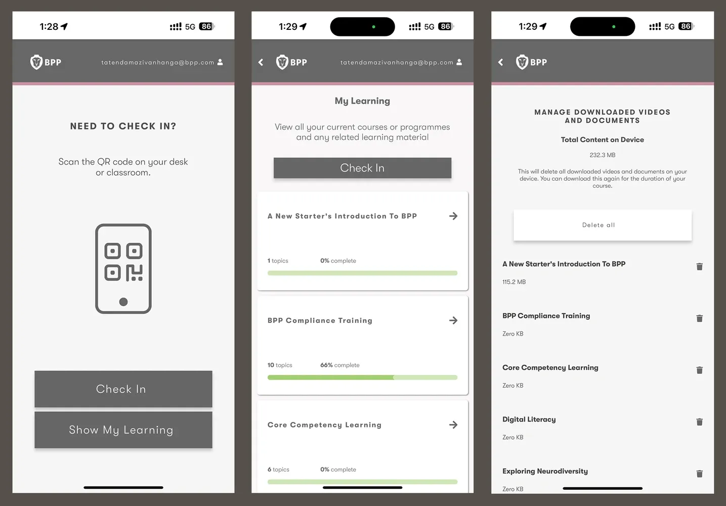
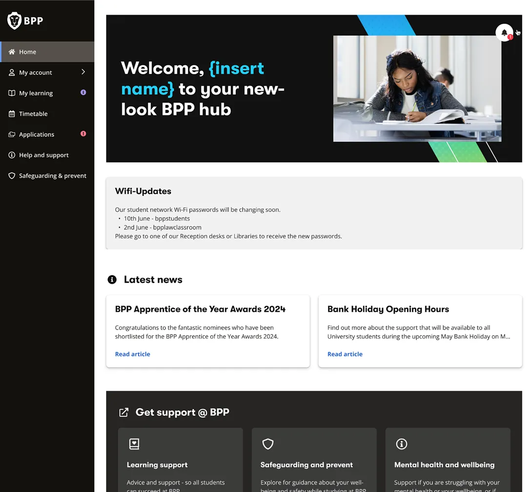
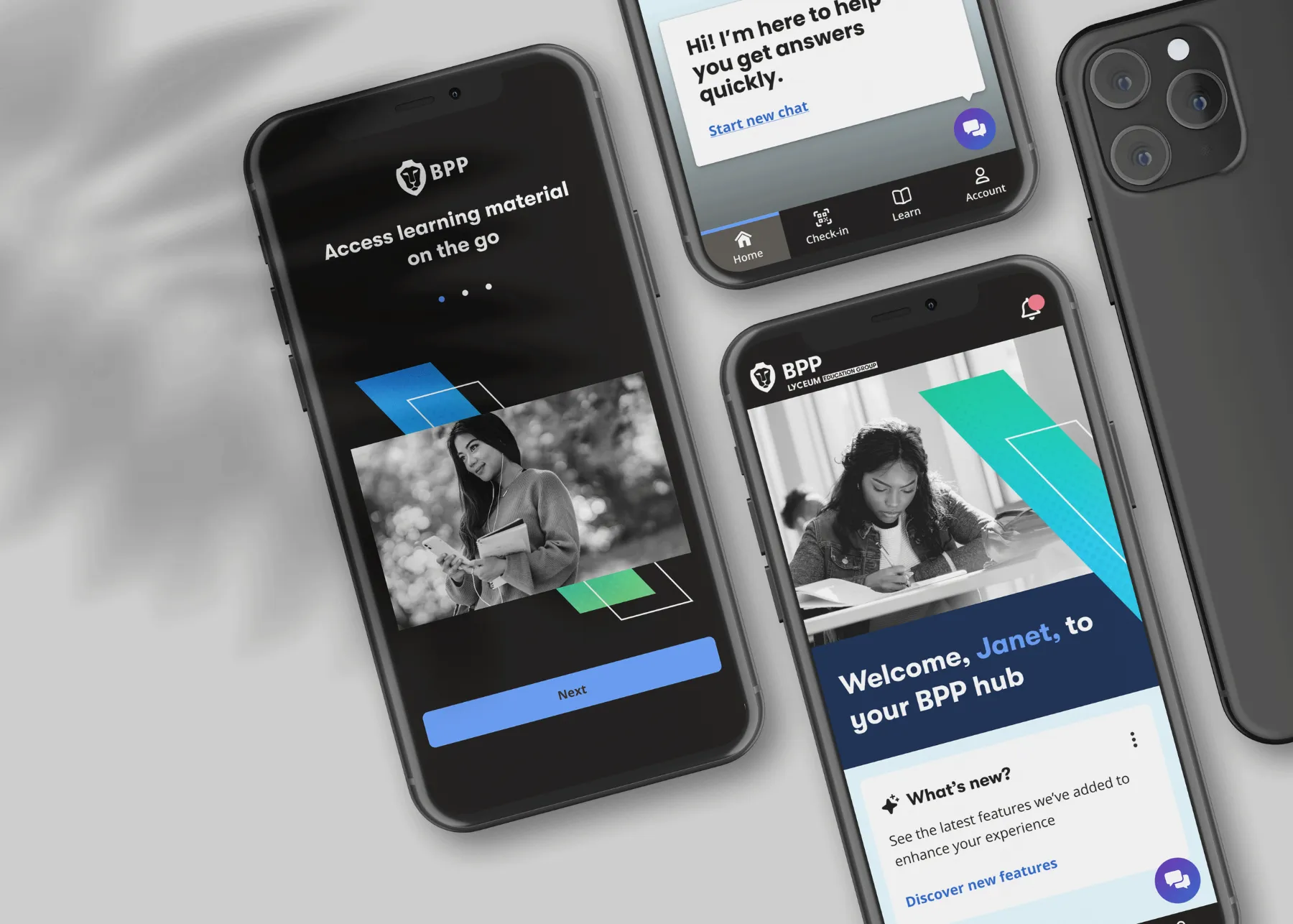
BPP's learner app was a shell that sent 50,000+ students off to web platforms. I led design from research to launch, and changed what the app was for.
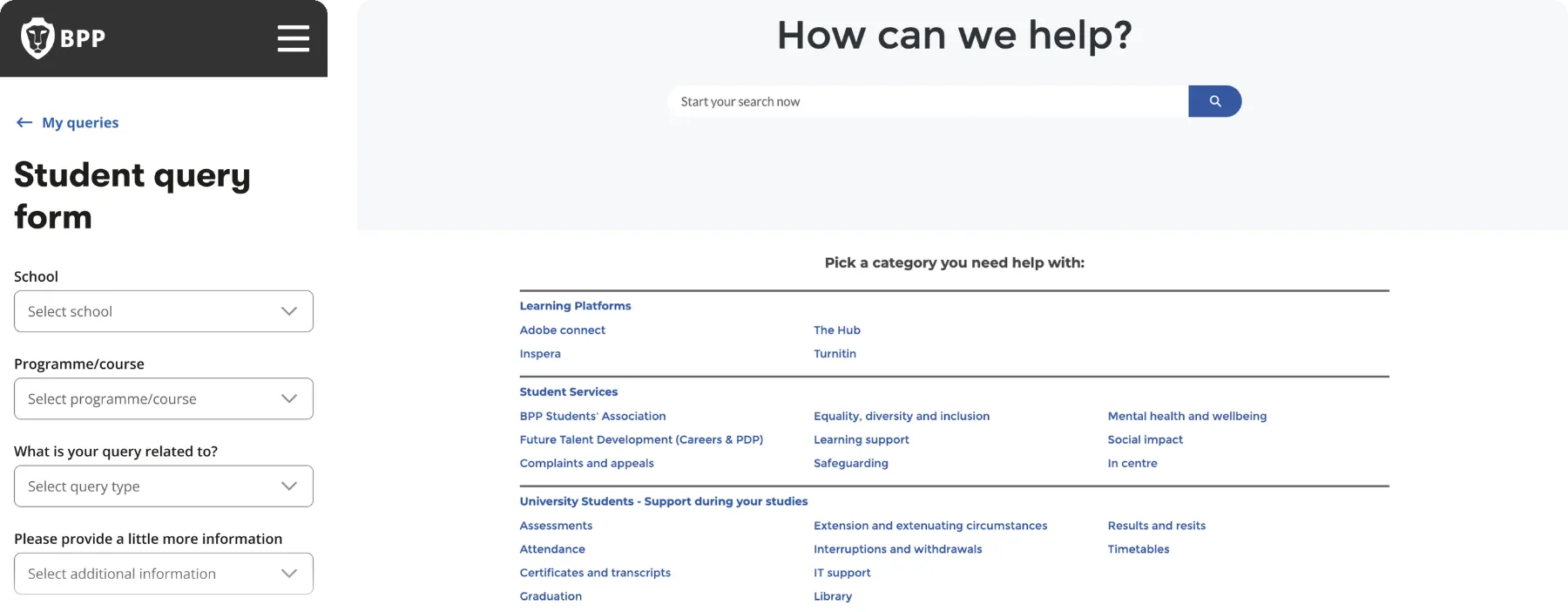
Nearly every task sent students somewhere else. They jumped between systems, searched instead of being guided, and left the app for basic tasks.


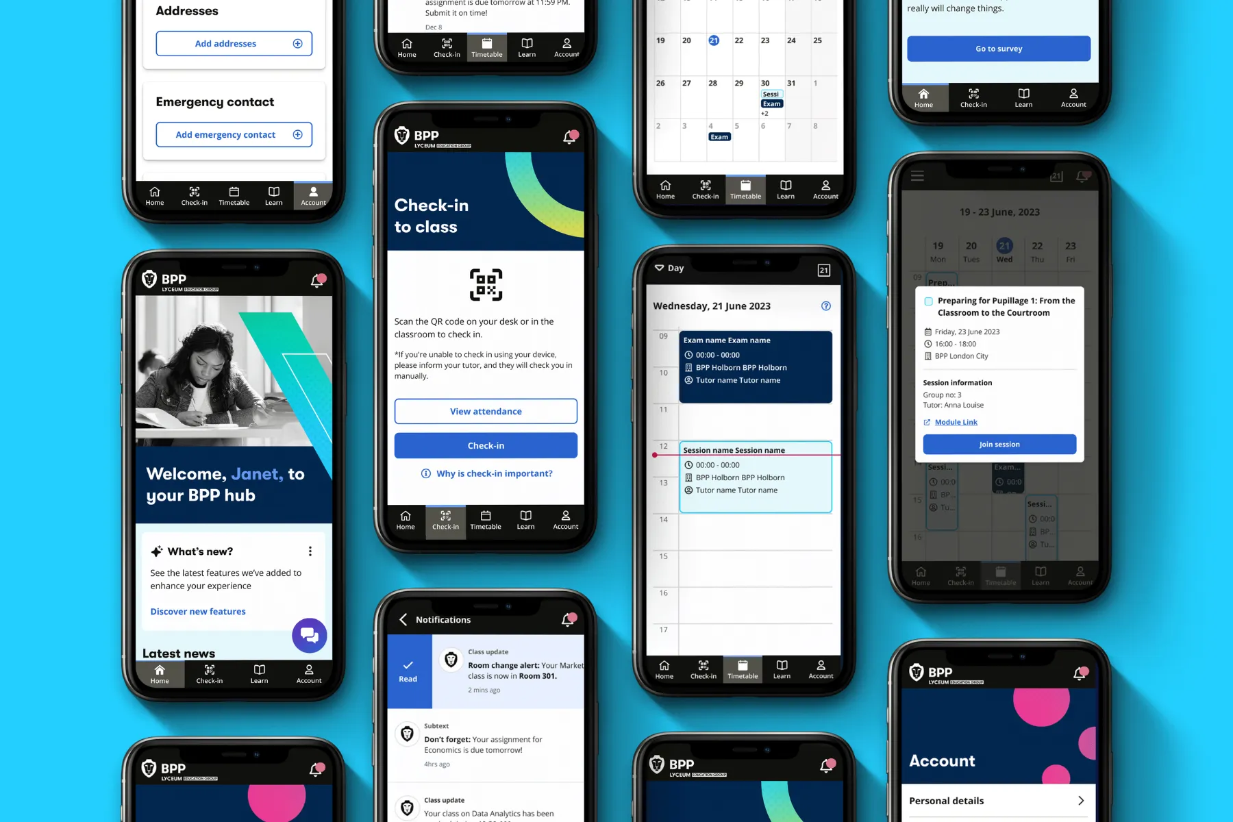
Check-in ends on a clear confirmation, which students called reassuring in testing.
Urgent alerts like room changes are sent straight away. The rest is left to the student.
I prioritised by three things, in this order.
The biggest challenge wasn't the UI, it was ownership.
No one owned the content, and outdated information loses trust.
The decision: marketing owns the content, with self-service publishing for university-wide announcements.
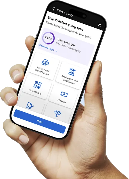
On mobile, students are on the move. The same priorities, rebuilt for quick moments: check in to class by scanning a QR code, see what’s next on a week-to-month timetable, act on notifications with a swipe, and get answers from Beep, the AI assistant. A weekly check-in gives the wellbeing team an early signal when someone’s struggling.
Next: validate with students across schools and campuses, work with engineering on identity signals, and phase delivery component by component.
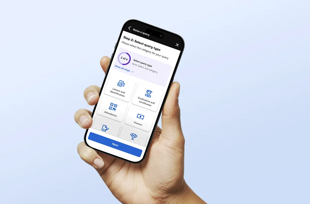
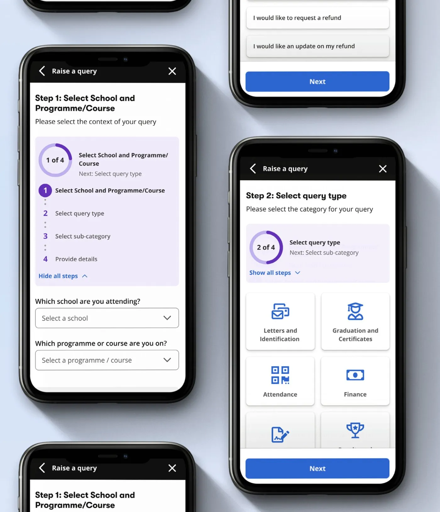
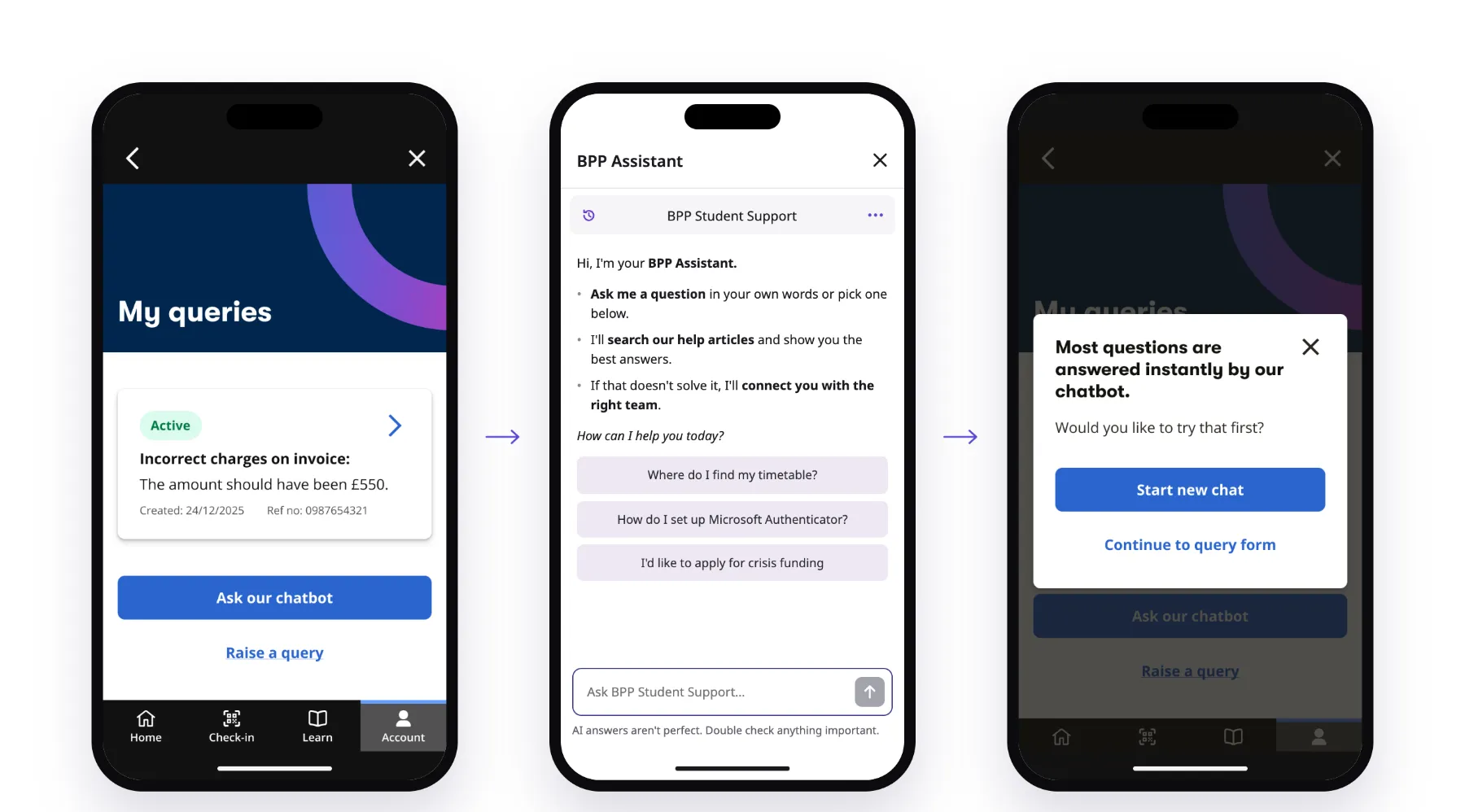
We reduced an open-ended support request into a small number of guided decisions, helping students describe what they needed without having to understand the structure behind the service.

The full journey, from choosing a category to rating the reply, with help suggested along the way.
Rather than asking students to choose a department or category first, we started with the problem they were trying to solve.
The chatbot wasn’t the destination. It was the first step towards the right answer: simpler questions were handled there, self-service came next, and a human support request remained the fallback when neither could help.
Every query also told us something. The patterns fed into product priorities, help content and chatbot training.
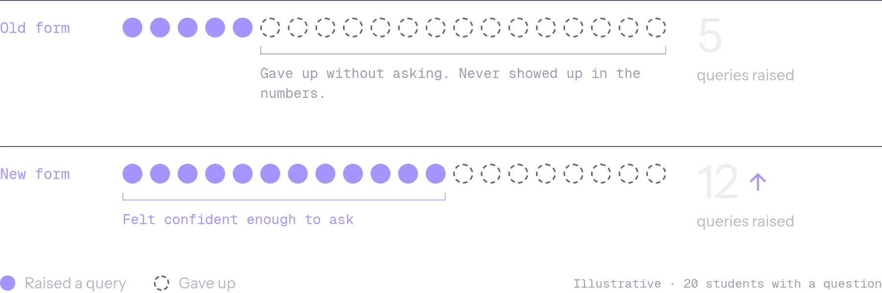
The new journey did what it was designed to do: asking for help got easier. But support measured success in tickets, and by that measure we’d made things worse. Both were true. Some of the friction I’d removed had been doing a job, filtering out questions the help centre could already answer.
The fix wasn’t to make asking harder again. It was to change the order: help first, a person only when needed.
Now, before I remove any friction, I ask two questions. What is this step doing for the service? And who’s measuring success differently from me?

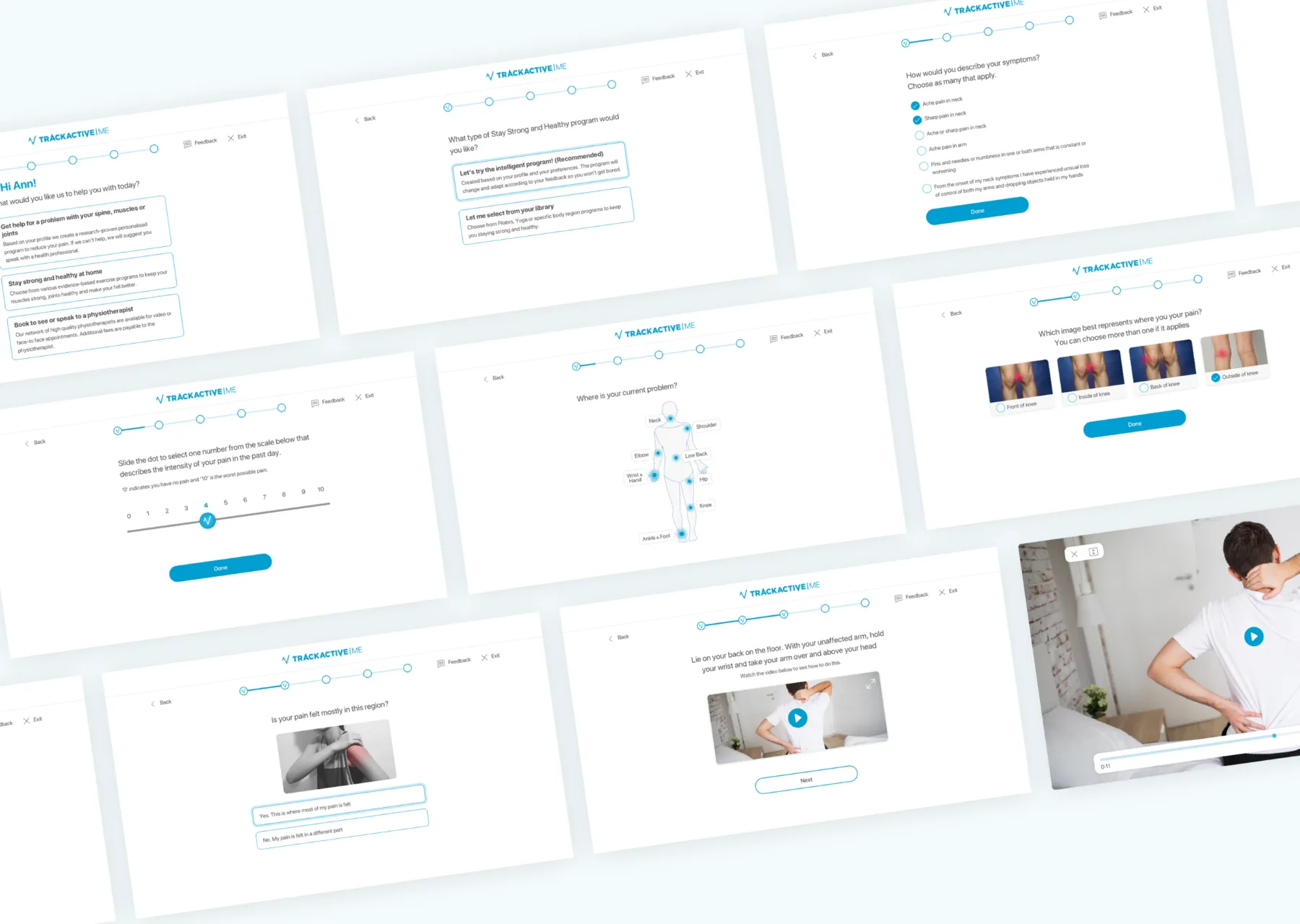
TrackActive Me is a registered medical device. Its chat-based assessments, diagnoses and exercise programmes are approved by health professionals and a university clinical governance team. When someone needs more than exercise, it refers them to their GP or a physiotherapist.
That meant the design had to be clear and trustworthy, and it had to work within clinically approved content.
Programmes asked people to exercise daily, or several times a week. But motivation drops fast, and when people stop, they don’t recover.
The redesigned app went live on iOS and Android: a chat-led assessment, personalised programmes, and a brand designed to bring people back.
I helped develop the brand style for the app: an optimistic colour palette, playful illustration and a warm, conversational tone. I also designed a bespoke icon set for the programmes and recovery areas.
I built the design system the developers worked from: colour, type, layout, components and a bespoke icon set, used across iOS, Android and desktop.
“Fantastic suite of exercises and programmes for the beginner with access to little or no equipment. Helpful videos and explanations to get the techniques correct. Nice graphics too.”
TrackActive Me launched on the App Store and Google Play in March 2020, and it’s still live today. Further funding meant we could build a desktop version for business subscriptions, which I designed.
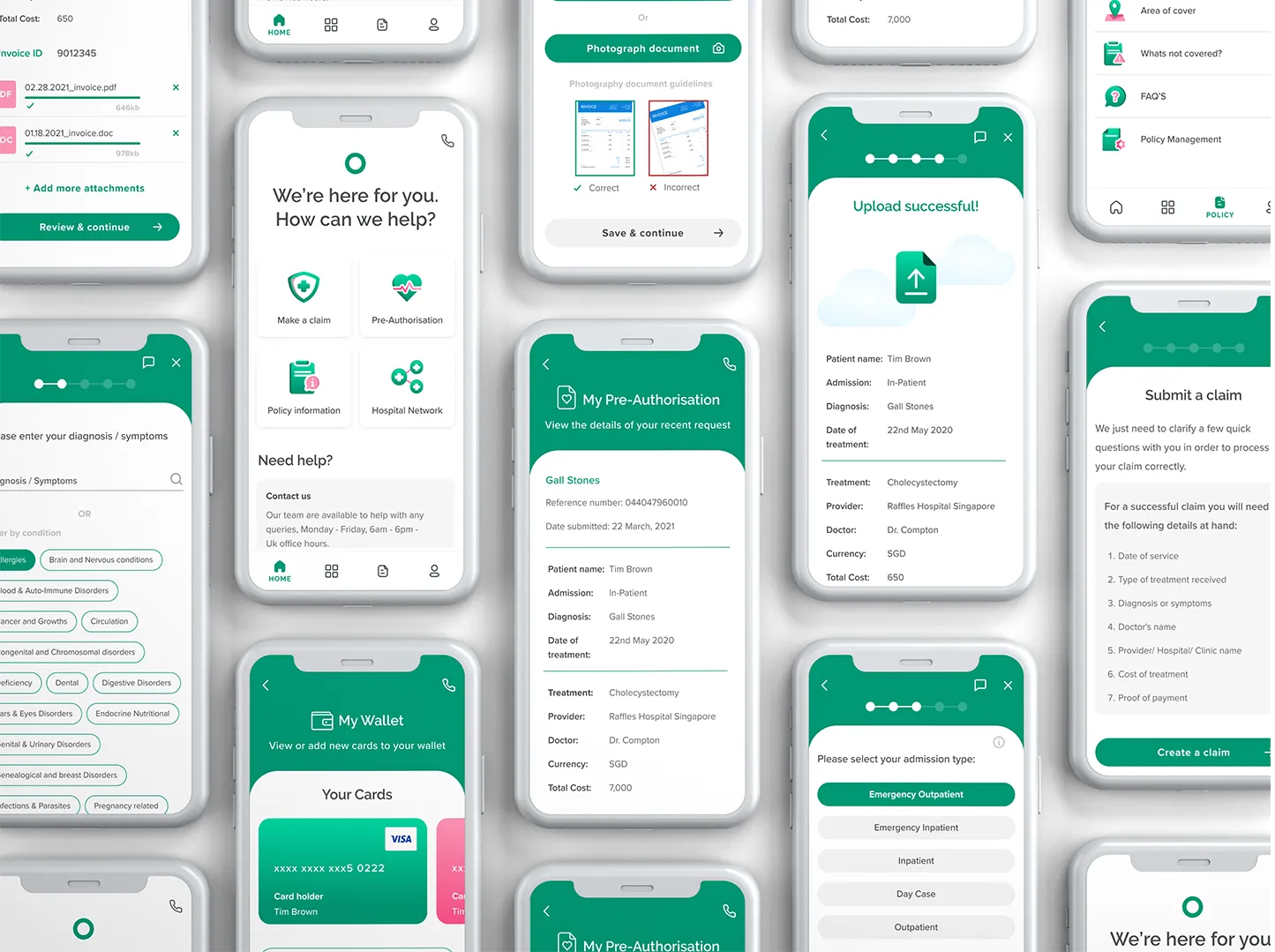
I spoke to expat customers about the moments a claim became stressful, and mapped every step of the existing claims and pre-authorisation process.
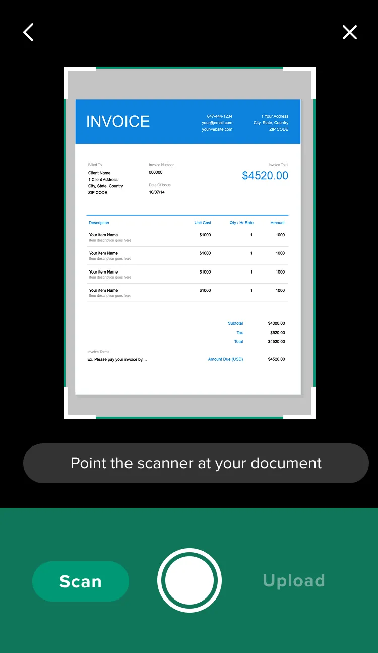
What that meant for the design: the claim couldn't get much shorter, but it could feel shorter, and it could wait for you. One decision per screen, clear progress, saved as you go, and help at the moments people got stuck.
A confident green carries the brand, while warm pinks bring empathy to a category that often feels clinical. I designed a bespoke icon set, with spot illustrations marking key moments like upload and submission.
Spot illustrations mark key moments, upload, submission, login and approval, so every milestone feels acknowledged.
Green drives action and progress, pink highlights files and secondary detail, and red is reserved for errors.
Standardised components, typography and spacing rules, documented with states, so the development team could hand off efficiently and add features consistently.
Stress narrows what people can take in. The claim didn't need to be simpler than it was: it needed to ask for less at once, and never punish someone for stopping halfway. I still design high-stakes journeys that way: one decision per screen, progress you can see, and nothing lost if life gets in the way.
{{ para }}
{{ para }}
Seven steps, from a tutor’s first visit to a submitted register.
{{ walkCur.d }}
Swipe the screen to change step{{ para }}
{{ para }}
{{ para }}
{{ para }}
“{{ tc.c8.pull.text }}”