Tracy O'Callaghan/ case study
← All workCase study · BPP Raise a Query

I made raising a query easier. Tickets went up.

The existing support journey made it difficult for students to know where to start. I redesigned the experience around the problem they were trying to solve, introducing clearer self-service and a chatbot-first model before escalation.

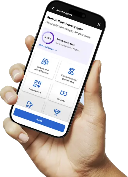
A hand holding a phone showing step 2 of Raise a Query: choosing a query type, with a 2 of 4 progress ring
Role
Led the design
Organisation
BPP
Platform
iOS and Android app
Worked with
Product, engineering, service design, student support
The problem

Students didn’t know where to start.

The old query form asked students to pick a school, a course, a query type and then a sub-category, all before they could say what was actually wrong. Most weren’t sure which category their question fitted, so they guessed or gave up partway through.

The help centre was meant to catch questions before they got that far. In practice it was a search box and a wall of links, sorted by how the university is set up rather than how students think about their problem. It was a lot to dig through, so most students didn’t.

Both routes expected students to work out where their question belonged before anyone could help them.

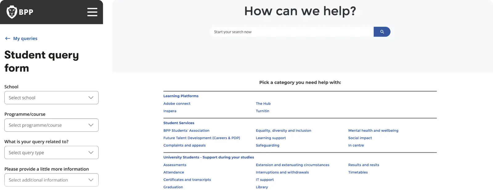
The old Student query form on mobile, with school, programme, query type and additional information dropdowns, beside the old help centre: a How can we help? search box above 24 links grouped by how the university is organised
The old query form, and a help centre with 24 links before you’d even scrolled
What I designed

Four steps, each one narrowing the question.

We reduced an open-ended support request into a small number of guided decisions, helping students describe what they needed without having to understand the structure behind the service.

  • 01School and programme
  • 02Query type
  • 03Sub-category
  • 04Details

Help built into the path

  • 01Help-centre nudgesRelevant answers as the query takes shape.
  • 02Duplicate detectionIf you’ve already asked, you see where it’s up to.
  • 03Confirmation promptsA quick check before anything is sent.
  • 04Deliberate light frictionJust enough to make self-service the easier first move.
  • 05In-app status notificationsNo more checking email to see what happened.
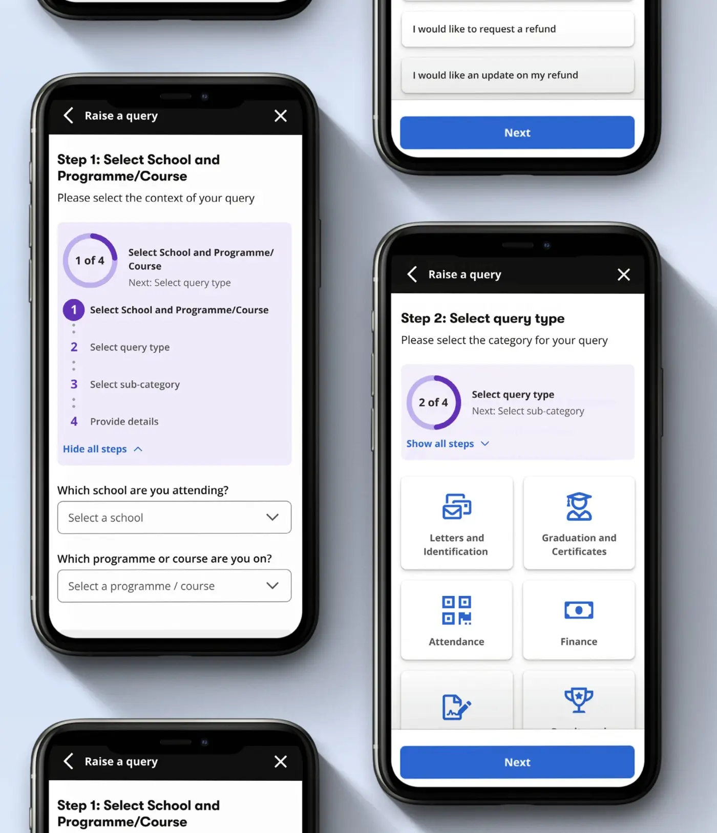
The guided query flow on phones: step 1, choosing school and programme with all four steps shown, and step 2, choosing a query type from category tiles
Prototype

Try the query flow.

The full journey, from choosing a category to rating the reply, with help suggested along the way.
Open in Figma ↗Open in Figma ↗
Then it launched

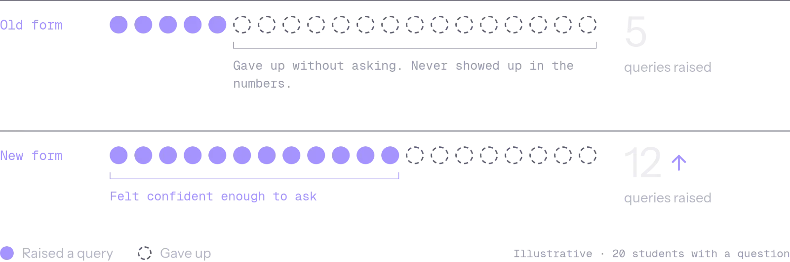
And tickets went up.

Not because the flow was worse. Students who’d given up on asking now felt confident enough to ask.

Illustration of 20 students with a question. Old form: 5 raised a query, 15 gave up without asking and never showed up in the numbers. New form: 12 felt confident enough to ask.
Decisions and trade-offs

So we changed the order.

Rather than asking students to choose a department or category first, we started with the problem they were trying to solve.

The chatbot wasn’t the destination. It was the first step towards the right answer: simpler questions were handled there, self-service came next, and a human support request remained the fallback when neither could help.

  1. 01 → FirstChatbot first
  2. 02 → ThenSelf-service next
  3. 03 → Only when neededRaise a Query
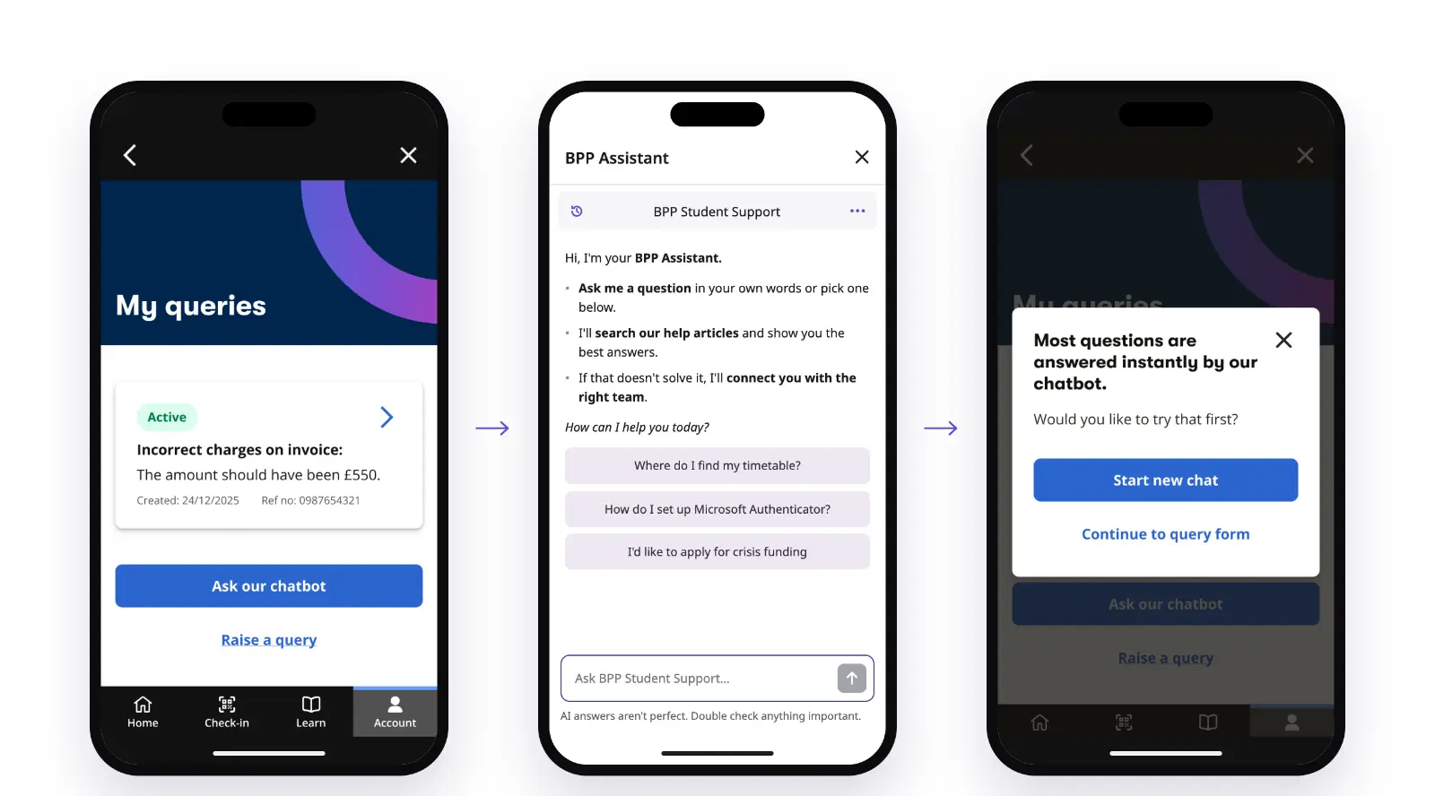
Three phones in order: My queries with Ask our chatbot as the main button; the BPP Assistant chat with suggested questions; and a pop-up saying most questions are answered instantly by our chatbot, with Start new chat and Continue to query form

“Ask our chatbot” became the main button. Raising a query dropped to a link underneath.

The assistant searches the help articles first, and only hands over to a team if that doesn’t work.

Tapping “Raise a query” gets one quick nudge. The form is still there if they need it.

Prompting the chatbot before the query form, then removing the form once the chatbot was resolving most queries.
Results

We tested the new order.

Ticket volume initially rose after the query journey got easier
Support load fell after the move to a chatbot-first model
A/B testing confirmed the chatbot resolved most queries before they needed a person

Every query also told us something. The patterns fed into product priorities, help content and chatbot training.

What I took from it

In support journeys, removing friction completely can work against you.

The new journey did what it was designed to do: asking for help got easier. But support measured success in tickets, and by that measure we’d made things worse. Both were true. Some of the friction I’d removed had been doing a job, filtering out questions the help centre could already answer.

The fix wasn’t to make asking harder again. It was to change the order: help first, a person only when needed.

Now, before I remove any friction, I ask two questions. What is this step doing for the service? And who’s measuring success differently from me?

A student with a backpack walking through the glass doors of a BPP study centre
Next project

Rehab only works if people do the exercises. I designed for that.